Logotype
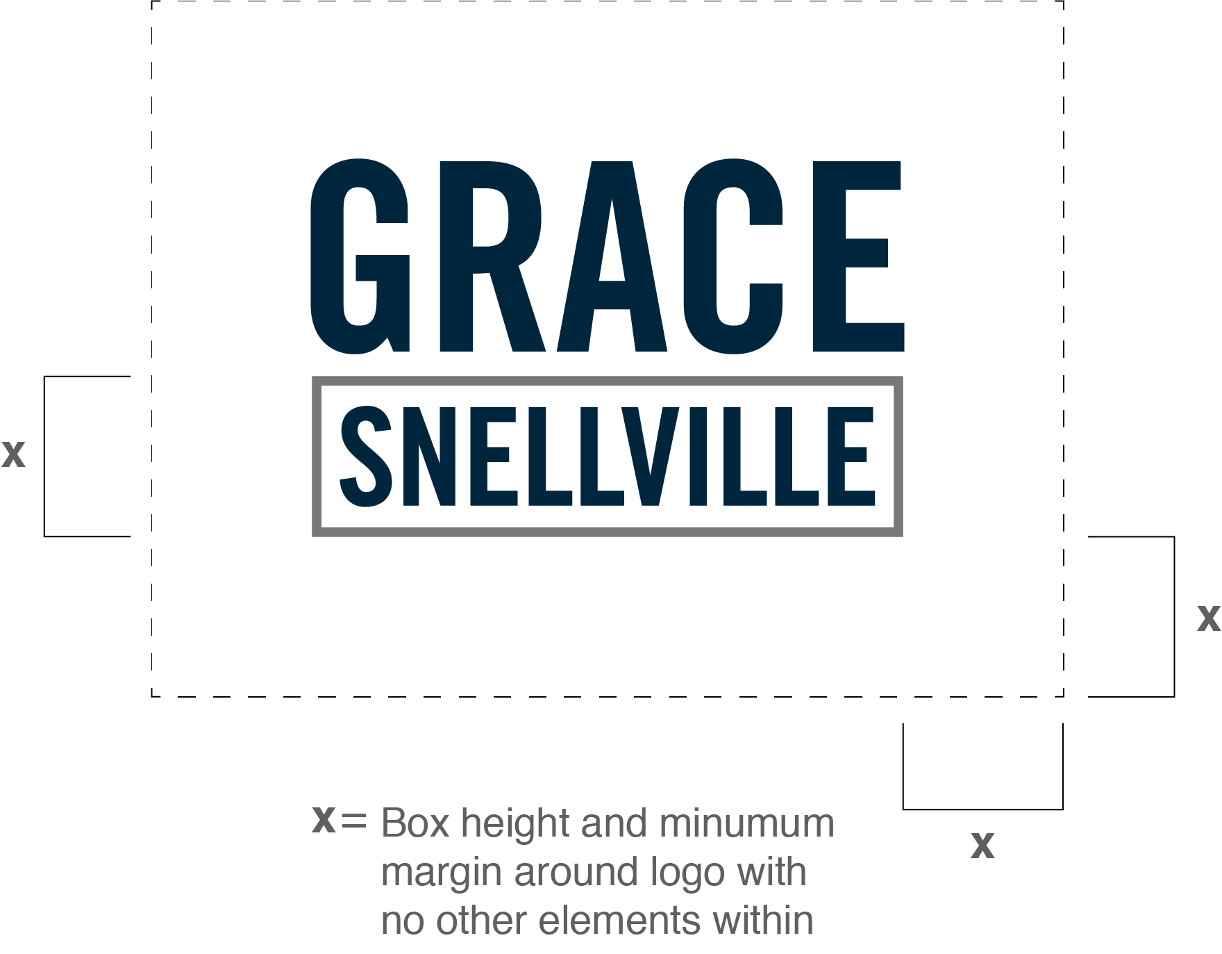
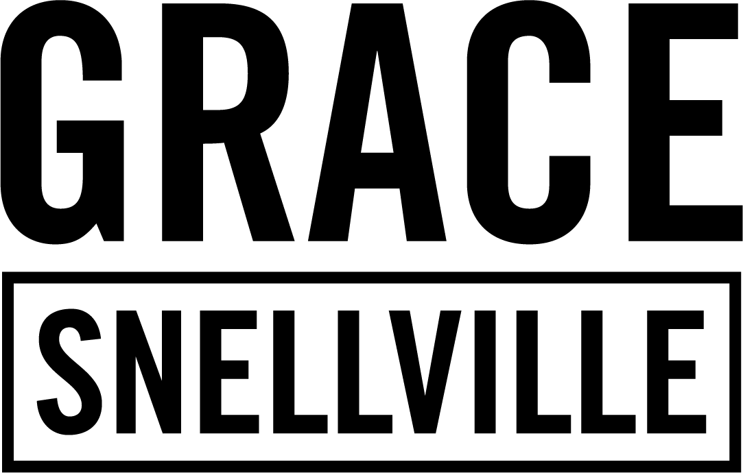
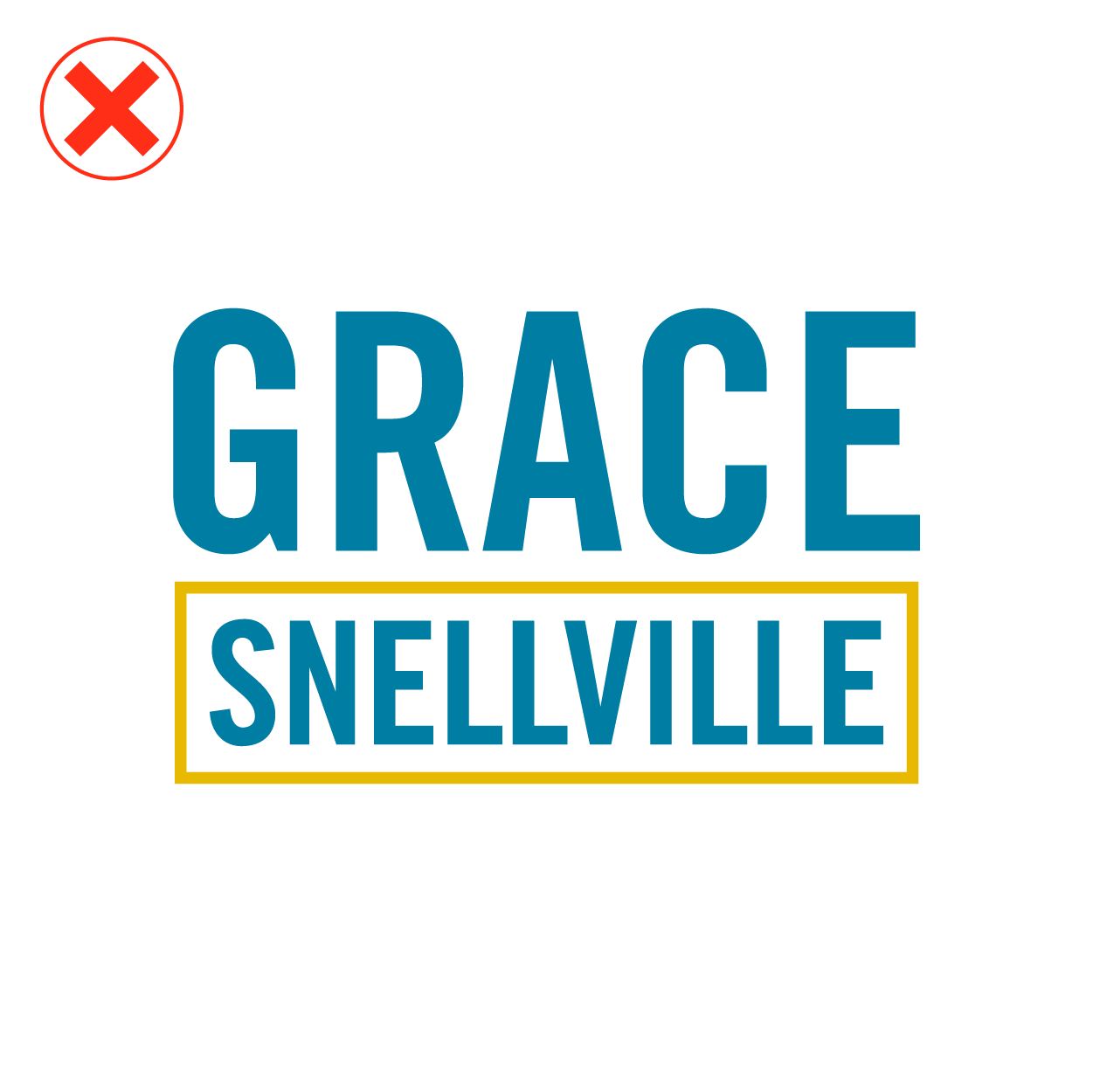
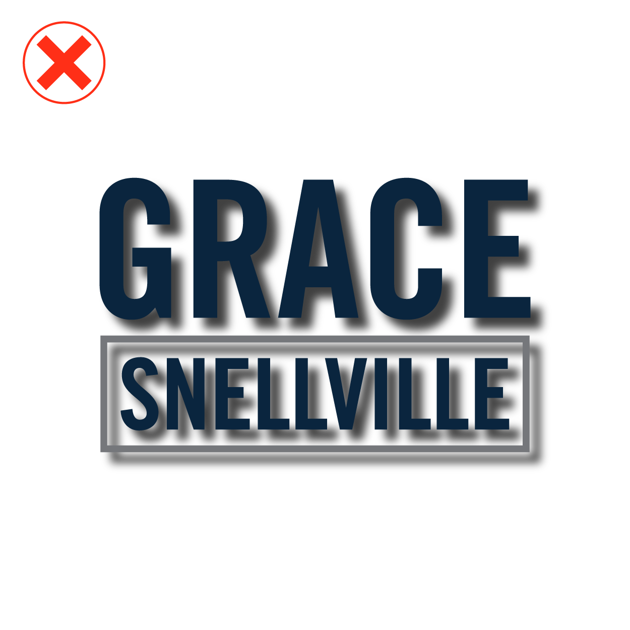
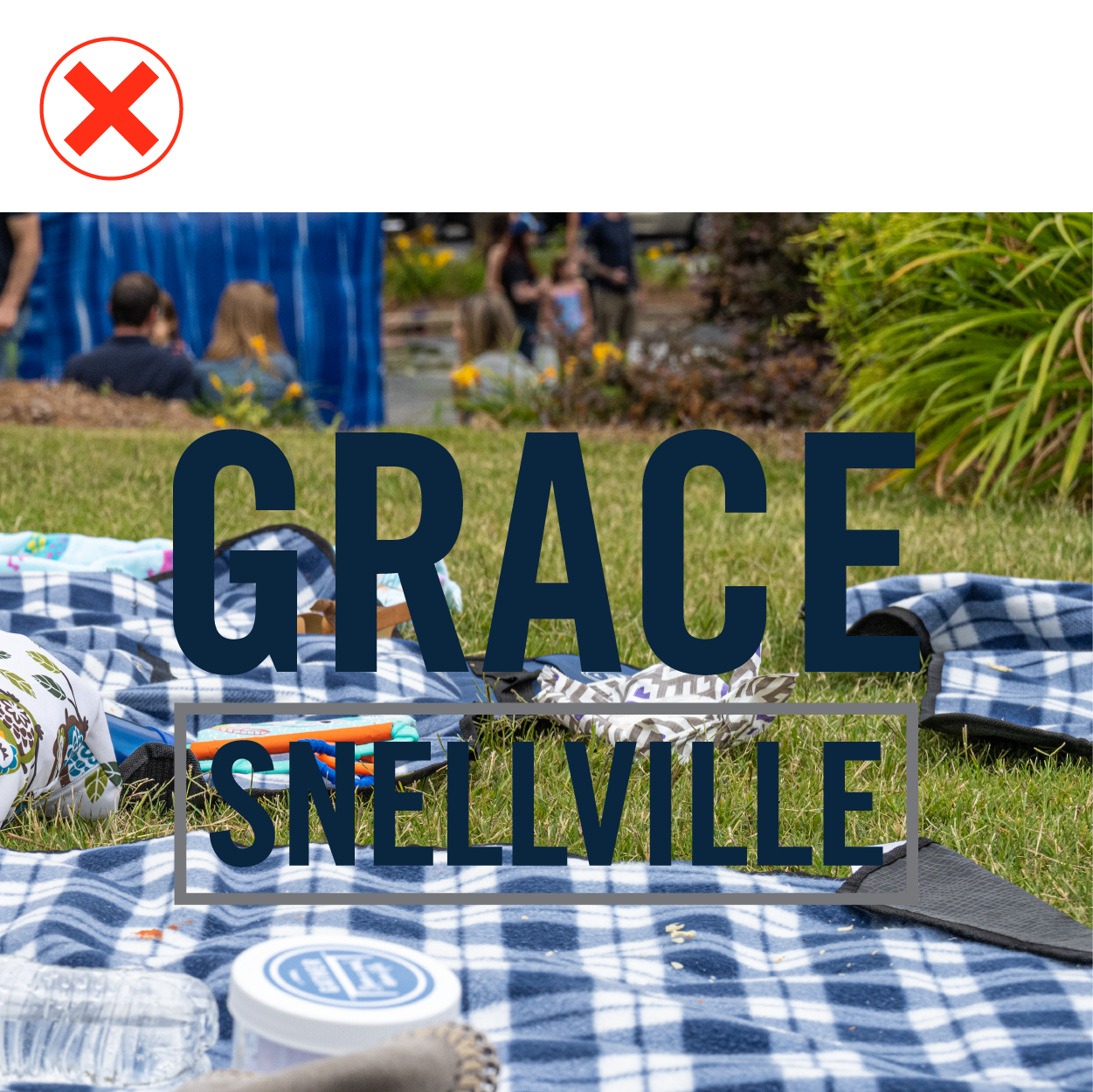
Grace Snellville is part of the Grace Family of Churches and therefore shares the logotype convention of the word Grace with the city/area name. Because it’s common for church names to include the word Grace, it’s important for users to follow these guidelines in order to properly identify as Grace Snellville church.
Guiding Principles
Identification: Use the logotype to inform the reader that the communication is from Grace Snellville, especially for external audiences.
Consistency: Consistent use reinforces the identity and brand of Grace Snellville.
Logotype Specifications

Colors
These are the primary colors for the logotype and other Grace Snellville branding.
Pantone 2965C
C=100 M=56 Y=19 K=73
#00263e

White logotype on dark or medium background

Logotype in black
Logotype Do’s and Don’ts

Don’t compress or stretch the logotype. Always scale in locked proportion.

Don’t remake or use different fonts.

Don’t change the colors.

Don’t use drop shadows or other effects.

Don’t use on backgrounds which obscure the logotype.

Don’t reduce or enlarge pixel versions of the logotype (.jpg, .png). Use the vector version for scaling.

Do use the color version on a light neutral background that doesn’t obscure the logotype.

Do use the white logotype on backgrounds with sufficient contrast for legibility and clarity.